
Graphical parsimony
by Florian D. Schneider, 18 May 2014
For researchers, a major part of their work actually is communication. I mean, all scientists are well aware that they very well have to publish articles. And, they are aware that they have to make them to have an impact. This is only achieved if they succeed to communicate.
Good writing is one thing. But the complex results in science can not be transported by language alone. In research papers, figures should do a good part of the job. But in most cases, they do a bad job.
As a fundamental critique to the practice of graphical communication Edward Tufte published this series of books, where he elaborated on why graphics fail at being informative and – more importantly – being honest.
- “The Visual Display of Quantitative Information”, (1983, 2nd Edition 2001)
- “Envisioning Information”, (1990)
- “Visual Explanations: Images and Quantities, Evidence and Narrative”, (1997)
All published by Graphics Press, Tufte’s own publishing house.
The first one is the most interesting in my eyes because it explains Tuftes idea of Graphical Excellence and his fundamental concepts of the data-ink ratio, chartjunk, graphical integrity and the lie-factor. The book also gives quite some applicable advice on how to revise graphics and what to avoid.
The second and third elaborate on the visualisation of ‘verbs’ and ‘nouns’, respectively, with many repetitive examples on maps or timeseries of multi-dimensional data. I’d say it is worth looking into them, but not necessary to buy them. They might be more useful to designers of infographics for newspapers or magazines than for original research.
My idea is to write a series of posts to note down things that I found extremely useful for visual communication in research, starting today with the concept of graphical parsimony.
Tufte’s data-ink ratio
Tufte constructed the data-ink ratio,
\[\textrm{data-ink ratio} = \frac{\textrm{informative data-ink}}{\textrm{total ink used in the plot }}\]where data-ink is understood to be all the surface covered by meaningful and informative data. Oposing to that, he defines all the non-informative elements of the graph like boxes or decorations as chartjunk.
Since researchers designing graphics usually do not concern themselves with measuring the actual ink that is required to plot them, and since todays graphics are mainly viewed on screen and not on paper, the metric is quite abstract, incomplete and impracticable in my eyes. The point Tufte wants to make is still valid: remove anything that does not contribute significantly to the message. However, I would put it differently:
Start from a blank screen and add as much graphical elements as necessary, but nothing else.
Graphical parsimony
In descriptive statistics and modeling, researchers know the principle of Occam’s razor: To describe a thing, use as few elements as possible and as much as necessary.1
Tufte applied this to data plots in a very consequent way and condemned unneccessary figure elements, shadings, lines, labels, marks and decoration. He explored ways of reducing the axis or the lines that are required to give the actual information. Still, I think he got it the wrong way! In his books, Tufte usualy takes a published negative example and presents his own re-designed version, sometimes just by erasing elements like grids or boxes.
As a researcher I do not need to re-design my own graphs. I do design them from scratch. There’s no need to eliminate useless elements. I start from a blank sheet of paper (or screen) and I only add the elements that are contributing significant information. To me, this way of seeing it is more logical. Because now, I can think in graphical elements.
And further, the smallest units of graphical displays are not lines or points only, as the following example shows.
Example: The boxplot
One example Tufte uses is the boxplot, which was invented by John W. Tukey. See here, the originally suggested version by Tukey and the minimalised solution of Tufte, the so called mid-gap plot. In contrast, the default in R using a combination of dashed, short and long, thin and thick lines and boxes. 2
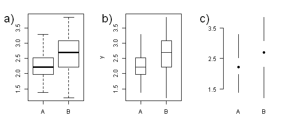
Tufte argues that the four lines around the box, which depicts the interquartile range that includes 50% of the data, are completely redundant. They can be removed, because the range is already given by the ends of the whiskers.
But here is some critique: A box in a boxplot carries information, because it is a box. There is a social convention that makes the reader understand that the box includes the actual data that are not depicted here. In contrast, the mid-gap plot suggests this range is somehow empty. Finally, plotting the box allows a more accurate estimation of the range of the inter-quartile range by the observer 3.
If you remove one line from a box, it is no box any more. And boxes are valid elements in their own right. That is what Tufte, being a statistician and not a designer by training, tends to underestimate: There are informal conventions and emergent properties of shapes and patterns. There is a graphical language that is beyond the mere amount of ink.
Tufte always added to apply his rules within reason, which pays honor to the blurry definition of what actually are the smallest graphical building blocks. It also acknowledges that the justified use of a graphical element depends on the context of the graphic. I’d say for instance, a rectangle or an ellipse are justified elements of a graph if they are meant to enclose a distribution of data points.
Sometimes it is easier to define when they are not.
Chartjunk
So opposing to data-ink, Tufted defined chartjunk as ‘ink’ that does distract from the actual message of the graph.
You might have observed that in Tufte’s version of the boxplot the frame around the plot and the axes were reduced to a minimum. They certainly do not contribute to the information carried by the graph and must not be plotted.
The axis itself is only as long as the range of axis labels provided since the extensions of axis to an unlabelled end-point is meaningless. It is arguable if the choice of axis labels is sufficient to locate the indicated values on the y-axis or if the tick marks are chosen too arbitrarily.
The same is true for grid lines, that often are plotted with solid lines in the background of the graphic. In former times, they were necessary to correctly place the data points in the coordinate system. In the first place, they were a tool for drawing the graph.
Still, some software provide them by default like Excel or the R package ggplot. In most plots, they are not necessary to read the distribution of data-points. For instance, where few anonymous (i.e. unlabelled) data points are scattered on quite abstract axes, you don’t intend to show the position of point i. Instead, the purpose of the graph is to show the data point’s distribution on the axes or around some correlation. A grid would only distract from the actual message and invite the reader to locate single points (Fig 2a & b). A calm background without any lines is supporting the interpretation (Fig 2c).
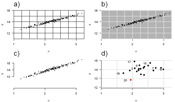
In some plotting arrays with individual and labelled data points, spaced out widely on the axes, grids might be useful for the reader to find the coordinates of a particular case (Fig 2d). But even in such cases, grids should be carefully applied.
Don’t accept templates
Sadly, hardly any software for plotting statistical graphs, be it R, gnuplot, Matlab, or Excel, applies these rules and concepts. This is of course because they are bound to use general templates that work for any given data. For instance, those templates can not distinguish if a scatterplot shows a distribution of anonymous data or the relative position of individual data. They will just apply the same rules for plotting. Also, they have to stick to cultural conventions, for instance on what a box in a boxplot means. And of course the programm developers try to create their own style on the generated output, so everyone sees this piece of science was done with their software.
That is why I find that whatever software one uses to generate research graphics, it is indispensable to get your hands dirty and design the graphical display to the needs of the data.
Concluding remarks
Design the display of your data starting from a blank screen. Each addition of an element to the graph (lines, points, areas, text) and each element definition (like line width, line type, color or rotation) must be justified by providing additional information or facilitating the interpretation.